
Today, we’re diving into the world of classroom decor with some super practical tips to make your classroom not only look amazing but also support your students’ learning. In my 14 years in education, I’ve learned a thing or two about classroom decorations. My classroom style has changed many times along the way, and the advice I want to share is based on my own thoughts. I’m definitely not looking to upset anyone, so take these tips and apply them to what best works for you. Read on for some classroom decor tips I’ve learned over the years.
This post contains affiliate links. You can see my disclosure here.
You can watch this YouTube video for some do’s and don’ts for decorating your classroom or you can keep scrolling to read more.
First, I want to talk about the influence of the classroom environment you create and how it can influence children’s cognition when it comes to learning. Research has shown that overly decorated classrooms can overwhelm students, specifically those with ADD, ADHD, and autism. They tend to struggle with filtering out what’s necessary and what’s not. In a study done by two psychologists from The Journal of Experimental Child Psychology, while we as teachers have good intentions when it comes to decorating, many classrooms end up being “sensory-rich in a way that could hamper children’s learning gains rather than helping.
I once had a student who would randomly take things down from the walls of my classroom. He would tear down random posters or decorations. Once I learned that too much could affect their learning environment, it became a light bulb moment for me.
I’ll be the first to admit that I hate blank wall space. I am the type that likes to have their walls covered. This is my home life, too. I can’t stand a ton of blank space on a wall. I used to think that if there was a blank spot on the wall, I was wasting a valuable opportunity to place an anchor chart or poster there.
The psychologists I mentioned earlier conducted a study in 153 classrooms and found that students who were placed in an environment with minimal to moderate decorations benefited more than those who were placed in an environment with heavily decorated classrooms.
Now, with social media and Pinterest, teachers can be flooded with “Pinterest-worthy” pictures of these perfectly curated classrooms. I share my own classroom in that space, but I’ve learned more about what I should and should not have in my classroom.
Per research, a good rule of thumb would be to leave 20-40% of your classroom wall space blank. Let me tell you, This was so hard for me to do.
Choose a theme for your classroom that you love and brings you joy, but don’t worry about having a perfectly decorated classroom. Your students will still learn even if you have a blank wall.
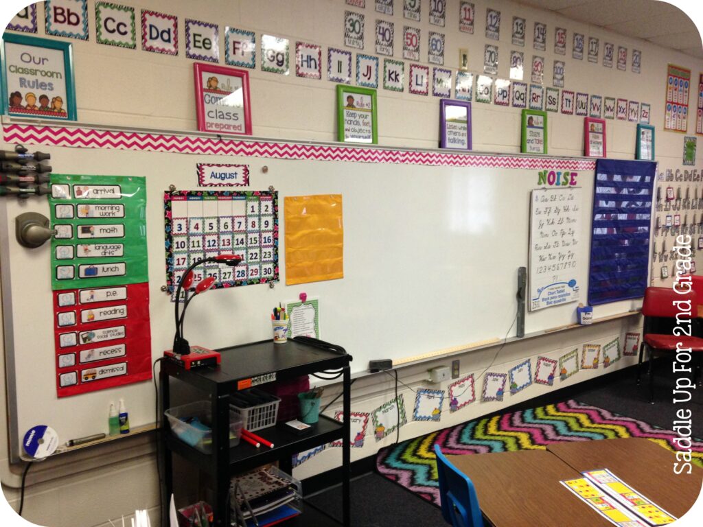
I’ve had several classroom themes throughout the years. I wish I had a picture of my first classroom because I know it was bare compared to what I have now, but I do have some in my 2nd year of teaching. I cringe looking at these photos, BUT for that time, it was ok, and the years in the classroom were some of my very favorite.
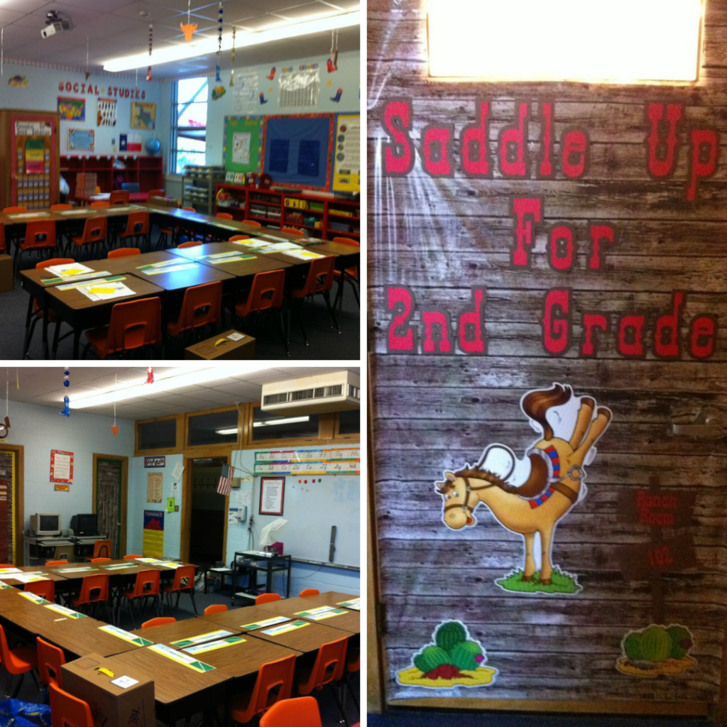
Are you at all surprised that my very first theme was Western? Check out my door display, which my mom helped me make with her Cricut and which eventually became the name of my business.
I scraped by with what I had and printed things off my computer for what I didn’t have. Here’s how I got started on TPT!
I kept this theme for three years before changing it to Zebra and chevron print. Here, we are throwing it back to 2014. I’m just shaking my head at so many things. Then, I transitioned into my burlap and bright color phase.

Now that we’ve taken that trip down memory lane, I want to say that there is nothing wrong with having a classroom theme. If you like succulents, it’s okay to have a beautiful succulent-themed classroom. If you like flamingos, go for it. Are you into the popular 80s vibe that is making its comeback? Great! There are lots of ways to have a themed classroom without it being so overwhelming. I had a lot of zebra and chevron going on in that room.
I recommend going with a color scheme that matches your theme. For example, for flamingos, you could use decor with shades of pink, green, and blue and incorporate flamingos subtly.
When I returned to the classroom this last year, I went with a color-based theme. After being off for a few years, I was going through things I had already purchased, and there was so much I didn’t want to use anymore because I bought something related to a particular theme.
When purchasing items such as plastic containers, book bins, pocket charts, etc. I recommend going with a neutral color that can be used with everything, no matter what theme you choose.
Also, keep in mind the diverse needs of your classroom. While you might love something, more than likely, you’ll have students who won’t feel this way, which is why your decor needs to be age-appropriate.
Please don’t come at me for this one, and know that I have made this mistake, too.
When it comes to your decorations, it can be tempting to buy a beautiful decor set that has cute teacher fonts. It might be a cute cursive that we are drawn to or a mix of upper and lower case letters in a fun way.
I LOVE FONTS LIKE THIS. However, I have learned that these types of fonts are ok for personal use things but not best practice when it comes to classroom decor because they are hard for students to read.
Whatever you put on your walls needs to be clear and simple for students to read, especially in primary grades where kids are still learning the foundations of reading.
I have learned this the hard way. I’m currently starting to edit my guided math units because this past year, using them myself, I realized that I used so many cute fonts that were hard for kids to read.
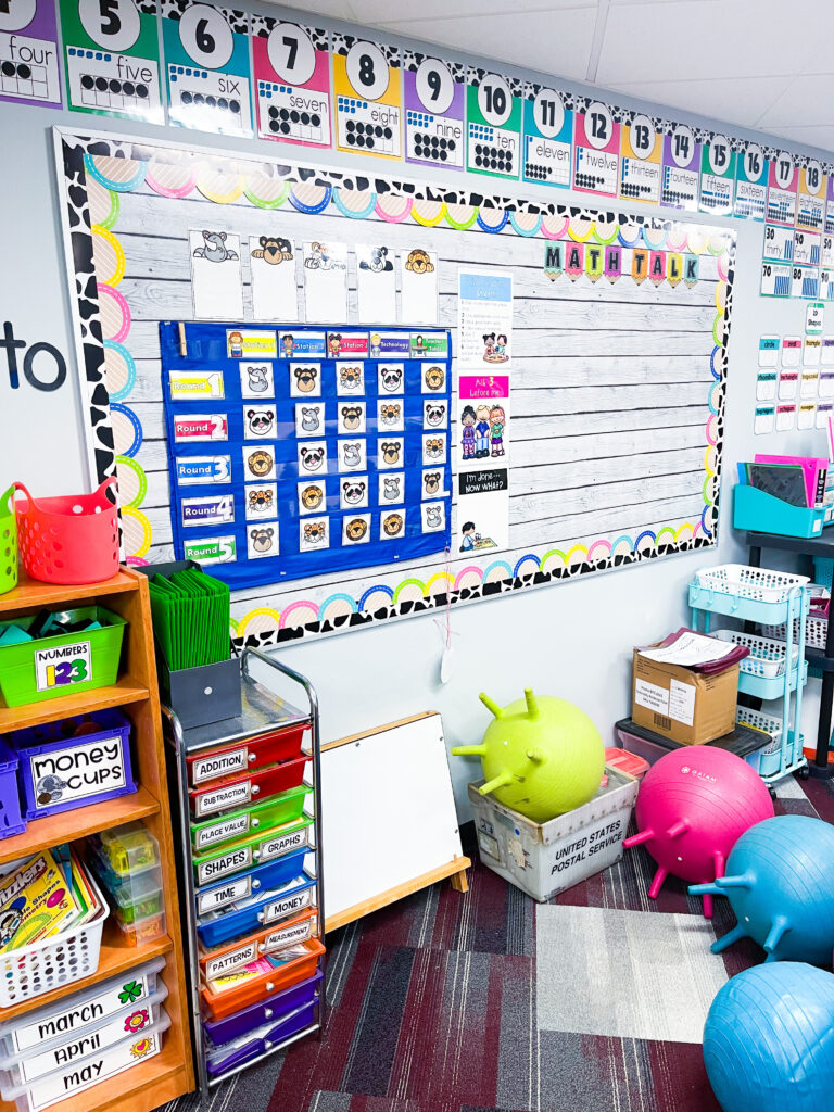
This past year, I wanted to incorporate cow print into my classroom, but it can be overwhelming if used too much. Instead of having everything in my room be cowprint like I had with my zebra room, I used bright colors that were pleasing to the eye and added pops of cowprint in minimal spaces, as I did here with my bulletin board boarder. I chose a bulletin background that had texture and design but wasn’t overbearing and would pair well with anything I layered on top of it.
This is my number line. Notice that the cow print is at the top. The important information is on a white background, and it’s easy to read. Whereas when I had my burlap theme, my number posters had my ten frames on a colored background.
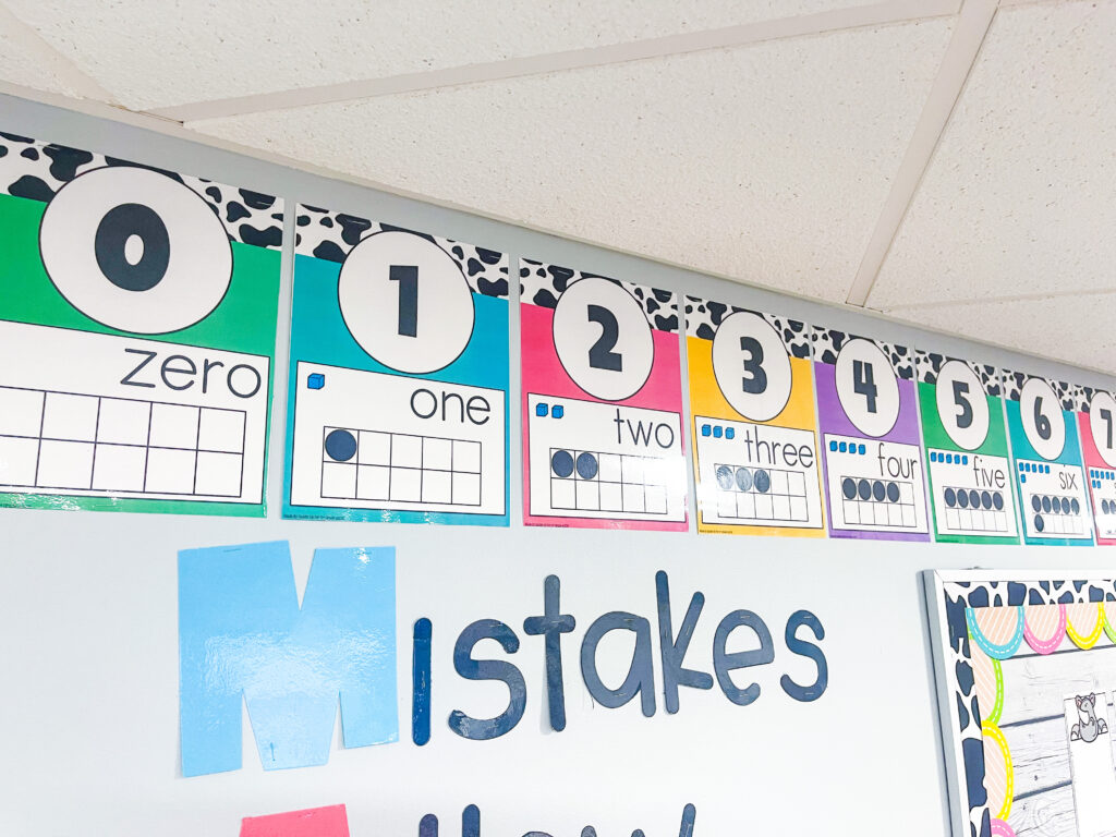
If you are using something with a pattern, the text needs to be on a solid background layered over the pattern. See the difference here and how much easier it is to read.


I recently learned about color accessibility. Color accessibility refers to color combinations that are easy for people with visual impairments or color blindness to distinguish. I’ve run Saddle Up for 2nd Grade going on 13 years. My brand colors have always been shades of turquoise and pink from the time I started this gig. Earlier this year, I made a huge change to my brand, specifically the colors I used, and here is why…the colors I was using were pretty, but they did not pass a color accessibility checker when put together.
My favorite color is turquoise, and I love white text. I 1000% prefer white text when applicable to black text. For the last 12 years, I have made resources using turquoise, various shades of pink, and green with white text.
When I learned that people with visual impairments couldn’t read it, I was devastated. I had built my business around these colors. I loved them and the way they looked together BUT at the same time I had to learn that yes, it’s my business, but my business isn’t about me. It’s about supporting and benefiting other teachers, which benefits the lives of student’s.

In early 2023, I started redoing resources and adding black text to make them benefit everyone. You have no idea how hard this is for me to do. When I rebranded earlier this year, I completely changed colors and chose colors that passed a color accessibility test when paired in different ways. It has been a huge change and adjustment for me, and I’m still not used to it.
Here’s what you need to consider when thinking about your classroom decor.
Avoid white text on lighter-colored backgrounds. You can see how these colors fail when combined during an accessibility test.


It’s okay with darker colors. When using light backgrounds such as neutrals, make sure the text is dark.
If white text is outlined with a black line, that does make it easier to read.


The point of my sharing this is that we can be tempted to use resources that might be a beautiful neutral palette but have white text. It’s beautiful, it is. However, it does not benefit those with visual impairments. They can’t read it.
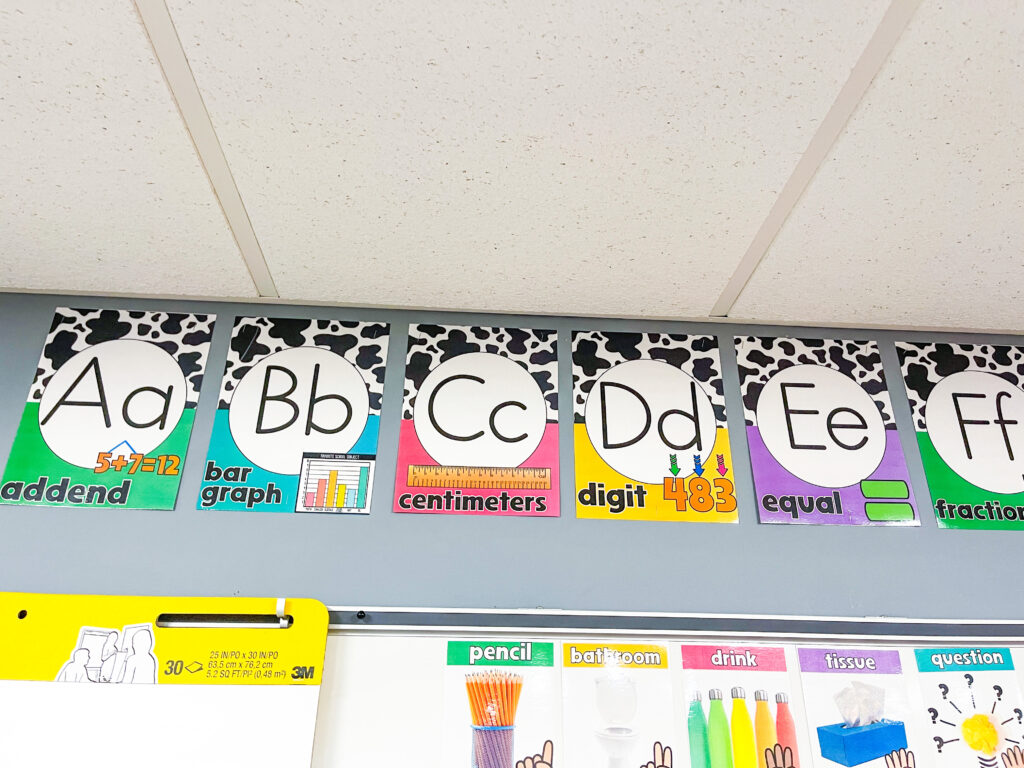
You’ll want to choose decorations that are colorful and fun but also functional. And remember, fonts are super important. Make sure any text is large, clear, and easy to read. Young learners need legible fonts to help them recognize and learn new words. Yes, it’s important to expose them to different types of print because that is what they will see outside of the classroom, however it isn’t how they should be taught.
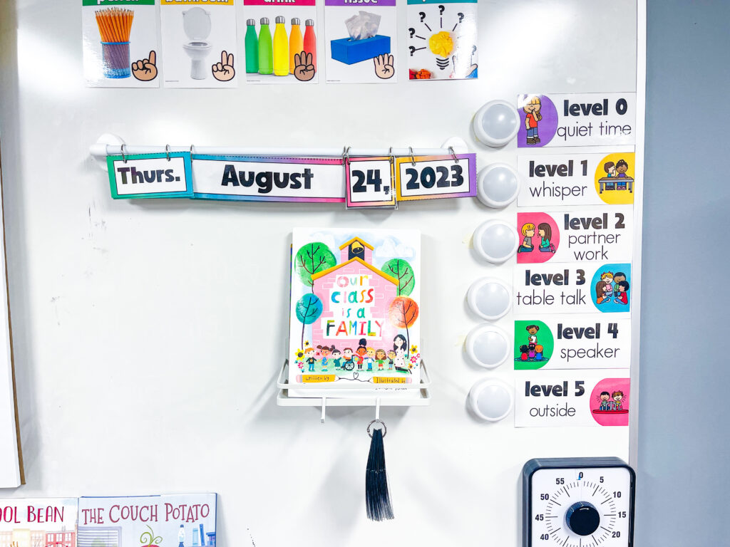
Educational items such as alphabet charts, number lines , sound walls, etc., but make sure that blank space is left for anchor charts to be displayed as they are created throughout the year.


This past year, I started off with a focus wall on the whiteboard space. I ended up changing it shortly after the year started. I took the focus wall down and divided the board into thirds. This is where I would display our anchor charts. I had a section for reading, language arts, and math.

This also allowed me to use this space for other things that came up throughout the year. I could easily take down the anchor charts when doing a room transformation or a specific unit.
Make space for classroom management tools and schedules that are used for daily routines. These spaces help students manage their own learning and can be a huge time saver.
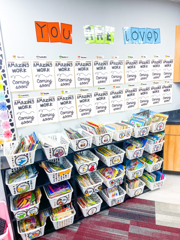
Create a space to display student work. This helps them take ownership of their learning environment. My favorite way to do this is using two prong file folders. I cut them in half so I could get two displays out of one folder. Throughout the year, I add their work to their display, such as writing, crafts, directed drawings, etc. Then, at the end of the year, I add a cover to it and give it to them as a 2nd grade scrapbook.
You can also display their work from the ceiling using string or yarn with. Here, I draped twine across the room and hung student work with clothespins. This is a great option if you don’t have much wall space and your school will allow it.

Overall, there is a happy medium to be had. When it comes to decorating our classrooms, we want to choose functional and purpose over fun and cute.
Don’t overcrowd the walls. Too much stuff can be overwhelming. Stick to the essentials.
Avoid distracting decor. Overly busy patterns or several mix-matched patterns should be avoided unless layered with a solid background and dark text. This can be more distracting than helpful. Your decor can still be simple and cute without causing sensory overload.
Remember, not every inch of your classroom needs to be decorated to make it welcoming. I’m telling that one to myself.
I have a full classroom tour blog post and a YouTube video that shows my classroom in detail. If you are like me and love taking a peek inside other rooms, you can find that there with links to most of my classroom decor items. You can also find my bold and bright classroom decor bundle inside my website shop. All the options come with and without cowprint.


If you are a part of the Saddle Up for 2nd Grade Teachers Facebook group, share a photo so we can see!